- Community Home
- Announcements
- Re: Welcome to our New Community!
- Subscribe to RSS Feed
- Mark Topic as New
- Mark Topic as Read
- Float this Topic for Current User
- Subscribe
- Mute
- Printer Friendly Page
Welcome to our Community!
- Mark as New
- Subscribe
- Mute
- Subscribe to RSS Feed
- Permalink
- Report Inappropriate Content
01-04-2022 11:26 AM - edited 03-02-2023 08:39 AM
Hey Community,
We are delighted to launch our newly redesigned Community.
We hope you like the fresh new look, and that the new design will allow you to find information you need quickly and easily. Curious about our new upgrades? We’ve highlighted a few of our favourites:
New Layout:
- The modern interface makes it easy to ask a question to our Community and receive quick responses from a Community expert
- No desktop? No problem. We made this platform mobile friendly! Making it easy to search or post a question while your on the go.
Boards & Forums
Announcements:
The Public Mobile team uses this board to feature new business updates and to keep our customers informed about new promotions and programs.
Get Support:
Looking for help with your Public Mobile service? This is the place to post all support questions. Our Oracles and support members answer topics posted under this board.
The Lounge:
Just for fun. Want to share your interests, hobbies and anything that’s not related to phone-stuff? The Lounge is the place to be.
Label your questions:
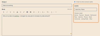
- Each question posted on the “Get Support” board will require a minimum of 1 label attached. Try to attach the label that fits best with your question.
Example: Why is my data not working, I changed my new plan to increase my data amount? Best label to attach: [Plans].
This will help keep all those great questions organized in our Community.
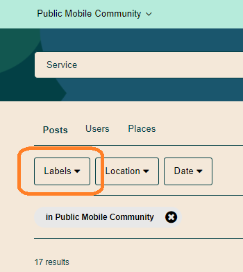
If you’re searching for a specific topic, try clicking our labels filter to find exactly what you’re looking for.
Private Messaging
- We’ve also refreshed the look and layout of the private messaging inbox. We’ve made it easy to find your threads and communicate with agents or staff.
- To access your private messaging inbox, click the envelope icon in the top right corner.
- Conversations are now threaded! If you need to leave and return to a message at a later time, your thread will save exactly where you left off.
For more information on Community visit these Help Article links:
Like most new things, it will take some getting used to. Remember we have our Oracle and Public Mobile teams to assist with any questions you have. Let us know your thoughts & happy asking & supporting!
- Public Mobile Team
- Mark as New
- Subscribe
- Mute
- Subscribe to RSS Feed
- Permalink
- Report Inappropriate Content
01-12-2022 03:50 PM - edited 01-12-2022 03:50 PM
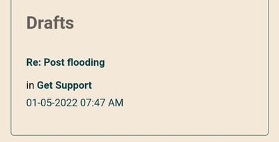
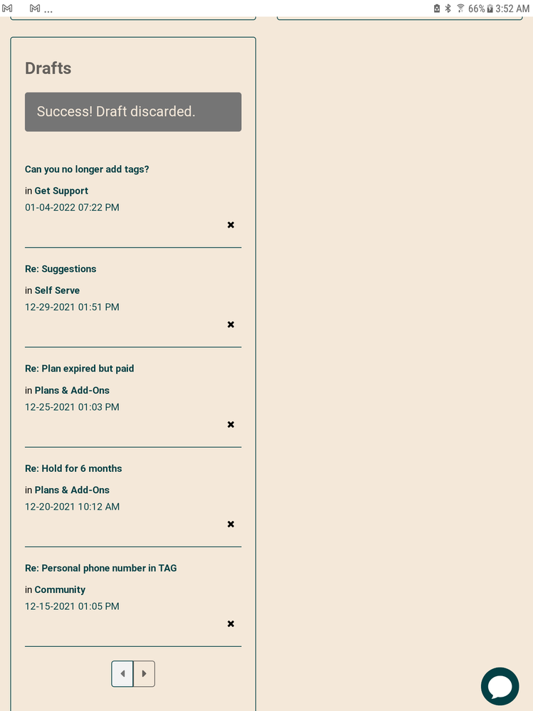
There has always been autosave you just have to go to your drafts in your profile. I did notice that when you reply to a post that you had previously been replying to but abandoned before posting it will now give you a prompt to load the autosaved draft from your profile. They didn't have that feature before which resulted in me having a lot of drafts stored up that I had forgotten to return to finish and post. The consequence of my poor tablet's habit of randomly rebooting.....soon to be resolved by my purchase of a Lenovo chromebooks thanks to @rossputin's post yesterday of the discounted tablet.
- Mark as New
- Subscribe
- Mute
- Subscribe to RSS Feed
- Permalink
- Report Inappropriate Content
01-12-2022 08:47 AM
for one who reads through replies before posting I think it's helpful being able to reference the original post on a later page rather than having to go back to page 1.
all pm needs to do is add the all topics and all posts back and solutions

other than that I actually prefer the changes except for the same color background for replies. the auto save feature is awesome! I don't have to retype long posts👍
- Mark as New
- Subscribe
- Mute
- Subscribe to RSS Feed
- Permalink
- Report Inappropriate Content
01-12-2022 06:29 AM
I don't believe you'll find many who like this new format. I'll say that my opinion is it being really really bad. I suspect that Public Mobile may have little choice on this matter and we can only hope that this new site's glaring deficiencies are addressed.
- Mark as New
- Subscribe
- Mute
- Subscribe to RSS Feed
- Permalink
- Report Inappropriate Content
01-12-2022 06:13 AM
Wow what a change. I think I am still processing it. I can tell you having the OP's dominating the top of each page on my phone is very annoying!
- Mark as New
- Subscribe
- Mute
- Subscribe to RSS Feed
- Permalink
- Report Inappropriate Content
01-11-2022 05:57 PM
@J_PM Sorry to say, I think this new format is quite awful!
- Mark as New
- Subscribe
- Mute
- Subscribe to RSS Feed
- Permalink
- Report Inappropriate Content
01-11-2022 12:26 PM
Lol....you better pull up Google maps to navigate your way around it is easy to get lost. You can pm me if you are feeling really alone and have lost your way.....I always offer a friendly ear and a way out.
- Mark as New
- Subscribe
- Mute
- Subscribe to RSS Feed
- Permalink
- Report Inappropriate Content
01-11-2022 09:54 AM
Help! I feel like I've been dropped in a foreign land! Where is everything? I was just starting to feel like I was fitting in. I wasn't expecting this. Not cool dude.
- Mark as New
- Subscribe
- Mute
- Subscribe to RSS Feed
- Permalink
- Report Inappropriate Content
01-09-2022 11:22 PM
Definitely some getting used to!
Though, hopefully it won't randomly repeat characters especially when trying to erase anymore. I experienced quite the glitch at least on mobile browser, fairly frequently.
I was hoping the ability to quote while on mobile view would be added but it doesn't seem to be the case.
I have to say I agree re the white background too, it is strange having it all the same background color
- Mark as New
- Subscribe
- Mute
- Subscribe to RSS Feed
- Permalink
- Report Inappropriate Content
01-08-2022 03:34 PM
Wow.
The majority of these changes definitely encourage me to NOT come back here to help out. Maybe that is PM's intention?
While streamlining categories is nice, the continuous thread thing without an option to jump to "last (read) post" (ast least that I can find) is really raking up time fast.
In the previous layout I often stopped by on a quick break, browsing through the "latest posts" and "latest topics", and jumping in if I felt like I was able to contribute. That's pretty much impossible now.
Also: Why are my posts (some from a couple of years ago!!!) showing "edited today" (or within the last week) when I have not touched them at all, have not been logged in at the time of the edit stamp, in fact? I understand that PM owns the content in this community but some unknown person having access to my community account and messing with my "work", without indication that whatever changes they made are not mine, is not cool!
- Mark as New
- Subscribe
- Mute
- Subscribe to RSS Feed
- Permalink
- Report Inappropriate Content
01-08-2022 03:13 PM
Thanks @computergeek541.
I have already adjusted that setting and yeah, it doesn't help much. It's like replacing an inconvenience with another one lol. Really hope they are listening to all the feedback and making adjustments soon.
- Mark as New
- Subscribe
- Mute
- Subscribe to RSS Feed
- Permalink
- Report Inappropriate Content
01-07-2022 11:05 PM - edited 01-07-2022 11:17 PM
hi

I prefer this style
- Mark as New
- Subscribe
- Mute
- Subscribe to RSS Feed
- Permalink
- Report Inappropriate Content
01-07-2022 05:15 PM
@fujiyama wrote:So far I'm not liking the new layout... After a few days, seeing the OP on every page is more annoying than expected. Especially when they are long posts like most in Announcements are. Echoing what others have said: please add an option to turn this off or to hide the OP on subsequent pages.
The "Jump to first unread post in a topic" option for Linear layout also doesn't seem to be working.
The amount of clutter is this new site layout is challenging to navigate. You can adjust a settting to make this site show you more message posts per page. This would reduce the number of times that you see the first post of each thread. Unfortunately, this would also cause the need to do more page scrolling.
- Mark as New
- Subscribe
- Mute
- Subscribe to RSS Feed
- Permalink
- Report Inappropriate Content
01-07-2022 12:05 PM
So far I'm not liking the new layout... After a few days, seeing the OP on every page is more annoying than expected. Especially when they are long posts like most in Announcements are. Echoing what others have said: please add an option to turn this off or to hide the OP on subsequent pages.
The "Jump to first unread post in a topic" option for Linear layout also doesn't seem to be working.
- Mark as New
- Subscribe
- Mute
- Subscribe to RSS Feed
- Permalink
- Report Inappropriate Content
01-07-2022 12:59 AM
@J_PM Honest, how much room for changes and improvement for this new Community at this moment? Many of us have made suggestions and expressed some "inconvenience" we saw, but anything going to change? Just want to see if we should still suggest or better just get use to what was offered 🙂
- Mark as New
- Subscribe
- Mute
- Subscribe to RSS Feed
- Permalink
- Report Inappropriate Content
01-07-2022 12:57 AM
Oh look my toolbar isn't all squished when I choose my avatar reply box instead of just "reply".
What is a "avatar reply box instead of just "reply". " ??
- Mark as New
- Subscribe
- Mute
- Subscribe to RSS Feed
- Permalink
- Report Inappropriate Content
01-07-2022 12:33 AM
Agreed. It would be nice if they put the OP of the thread on subsequent pages behind a spoiler so its there for reference but doesnt confuse the user of it being the first page of the thread.
Oh look my toolbar isn't all squished when I choose my avatar reply box instead of just "reply".
- Mark as New
- Subscribe
- Mute
- Subscribe to RSS Feed
- Permalink
- Report Inappropriate Content
01-06-2022 11:59 PM
They should at least have the Page bar of the thread both on top and at the bottom..now we have to scroll all the way to the bottom and then hit Last page
- Mark as New
- Subscribe
- Mute
- Subscribe to RSS Feed
- Permalink
- Report Inappropriate Content
01-06-2022 11:43 PM
The "Recent replies" option from the drop down on the main page displays threads just like Recent Topics instead of the actual recent post usually starts with RE: thread title. If there was a recent post in this thread, the link on the Recent Replies feed brings me to the main post on the 1st page. Then I have to scroll all the way to the actual recent reply. The link should be the permalink that directly bring us to the recent reply post.
______________________________________________________________________
I am not a mod. Do not send me private message with your personal info.
If you need to contact PM Customer Support Agent, send a Private Message.
- Mark as New
- Subscribe
- Mute
- Subscribe to RSS Feed
- Permalink
- Report Inappropriate Content
01-06-2022 11:25 PM
- Mark as New
- Subscribe
- Mute
- Subscribe to RSS Feed
- Permalink
- Report Inappropriate Content
01-06-2022 08:27 PM
@softech thanks for heads-up 🙂
- Mark as New
- Subscribe
- Mute
- Subscribe to RSS Feed
- Permalink
- Report Inappropriate Content
01-06-2022 01:26 PM
- Mark as New
- Subscribe
- Mute
- Subscribe to RSS Feed
- Permalink
- Report Inappropriate Content
01-05-2022 10:46 AM
It is great that the replies will show "in response to .. " if you are replying a reply in between (not the original post from OP or the last one in the thread)

- Mark as New
- Subscribe
- Mute
- Subscribe to RSS Feed
- Permalink
- Report Inappropriate Content
01-05-2022 09:56 AM
Label your questions:
- Each question posted on the “Get Support” board will require a minimum of 1 label attached. Try to attach the label that fits best with your question.
Example: Why is my data not working, I changed my new plan to increase my data amount? Best label to attach: [Plans].
This will help keep all those great questions organized in our Community.
If you’re searching for a specific topic, try clicking our labels filter to find exactly what you’re looking for.
and this is smart, using the different Labels instead of different Boards. Bravos on the Good Move!!
- Mark as New
- Subscribe
- Mute
- Subscribe to RSS Feed
- Permalink
- Report Inappropriate Content
01-05-2022 07:52 AM
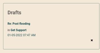
@darlicious Just tried again. I have to force Chrome into desktop mode to get the X. 🙄.
Chrome mobile:
Chrome forced into desktop mode:
So it does have the X when forcing into Desktop mode. Did not have to do that prior to this last update.
- Mark as New
- Subscribe
- Mute
- Subscribe to RSS Feed
- Permalink
- Report Inappropriate Content
01-05-2022 06:58 AM
- Mark as New
- Subscribe
- Mute
- Subscribe to RSS Feed
- Permalink
- Report Inappropriate Content
01-05-2022 04:13 AM
@Anonymous
Thanks....and tagged.
- Mark as New
- Subscribe
- Mute
- Subscribe to RSS Feed
- Permalink
- Report Inappropriate Content
01-05-2022 03:50 AM - edited 01-05-2022 03:51 AM
@Jb456 , @darlicious : ...and anyone else who used to use All Posts or Latest Posts, I had set up a bookmark for it. I'm still using it. I also think it should be on the main page.
I'm so far also not liking the OP stuck up top and really don't like the insertion of my post reply after I post but before I go back to All Posts.
Edit: lol...did they change it?
- Mark as New
- Subscribe
- Mute
- Subscribe to RSS Feed
- Permalink
- Report Inappropriate Content
01-05-2022 03:08 AM
Well whaddya know....I wish I knew that before!
- Mark as New
- Subscribe
- Mute
- Subscribe to RSS Feed
- Permalink
- Report Inappropriate Content
01-05-2022 03:04 AM - edited 01-05-2022 03:05 AM
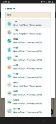
@darlicious Thanks for that. It works! Neat but there was always a directory. I think the way I do it (which was same in past is faster) only my opinion. If you go to your private messaging and open a new message then type anything in "Send To" users come up. Example below.
- Mark as New
- Subscribe
- Mute
- Subscribe to RSS Feed
- Permalink
- Report Inappropriate Content
01-05-2022 02:51 AM
No but it makes me wish I had cleaned up that section. Search your name in the search bar. Then choose "users" and your basic profile info comes up for you. Click posts and you can access your posts by page like before. Or anyone's posts....so that's kind of cool.
