- Community Home
- Get Support
- Re: Community Technical Issues
- Subscribe to RSS Feed
- Mark Topic as New
- Mark Topic as Read
- Float this Topic for Current User
- Subscribe
- Mute
- Printer Friendly Page
Community Technical Issues
- Mark as New
- Subscribe
- Mute
- Subscribe to RSS Feed
- Permalink
- Report Inappropriate Content
01-29-2018 03:25 PM - edited 01-05-2022 04:01 AM
Hey Community,
From time to time Lithium, our community platform, updates the system and causes some issues that changes how we interact with this community. Issues such as users are not receiving community notifications OR users are not being redirected to the first unread post. These examples might change the way we browse this community.
Use this topic to discuss and report any Community related issues. Out staff member, @David_J, will use this to track all reported issues. Let's help him to make this community even better.
Thank you.
______________________________________________________________________
I am not a mod. Do not send me private message with your personal info.
If you need to contact PM Customer Support Agent, send a Private Message.
- Labels:
-
Service
- Mark as New
- Subscribe
- Mute
- Subscribe to RSS Feed
- Permalink
- Report Inappropriate Content
01-25-2019 09:29 AM
Ta bien raison moi né aux québec ne peut meme pas acceder a mon compte depuis plus de 1 ans parce-que je suis de montréal alors qui aille se faire foute compagnie de broche a foins du vocales une voix humaine il connaisse pas sa pour aider les mal prit ou des personne qui on de la misère avec leur vu juste internet (WEB)la dessus passé une très belle journée..![]()
![]()
![]()
![]()
- Mark as New
- Subscribe
- Mute
- Subscribe to RSS Feed
- Permalink
- Report Inappropriate Content
01-25-2019 09:23 AM
Hey @quebec12345 vous ne voudriez pas venir du côté francophone?? Nous ne sommes pas très nombreux à aider..![]()
- Mark as New
- Subscribe
- Mute
- Subscribe to RSS Feed
- Permalink
- Report Inappropriate Content
01-25-2019 09:17 AM
David_J
- Mark as New
- Subscribe
- Mute
- Subscribe to RSS Feed
- Permalink
- Report Inappropriate Content
01-25-2019 01:31 AM
@quebec12345, merci beaucoup! Bon soir!
- Mark as New
- Subscribe
- Mute
- Subscribe to RSS Feed
- Permalink
- Report Inappropriate Content
01-25-2019 01:27 AM
@stonechucker oui c'est bien penser moi j'ai mit un pouce Merci et bonne journée.
- Mark as New
- Subscribe
- Mute
- Subscribe to RSS Feed
- Permalink
- Report Inappropriate Content
01-25-2019 01:06 AM
@David_J wrote:@stonechucker glad it looks better and makes things easier to see. Question for you around the 'hanging font modifier' - can you send me a screen shot as we're not seeing it here.
Thanks for making this happen,
David_J
Hi again @David_J, it appears I was mistaken. I’m currently writing this from an iPadAir running iOS latest version, Safari browser, and it looks fine.
My post when I mentioned it was holding, was on a Windows 7 PC in chrome browser, running a magnification program called ZoomText. Looks like the PC may be the issue.
More often than not, I’m on the iPadAir, so I think I flagged something that wasn’t there.
- Mark as New
- Subscribe
- Mute
- Subscribe to RSS Feed
- Permalink
- Report Inappropriate Content
01-24-2019 04:43 PM
@stonechucker glad it looks better and makes things easier to see. Question for you around the 'hanging font modifier' - can you send me a screen shot as we're not seeing it here.
Thanks for making this happen,
David_J
- Mark as New
- Subscribe
- Mute
- Subscribe to RSS Feed
- Permalink
- Report Inappropriate Content
01-24-2019 04:39 PM
@David_J wrote:
@stonechucker @NDesai @ShawnC13 @srlawren @Anonymous
The team just pushed the recommended changes to production (thanks for doing the groundwork on this) and it looks good. Please let me know if you see anything unexpected. Thanks again for the heads up on this issue.
David_J
@David_J I noticed it a moment ago before visiting this thread. It looks really good, better than my mock-up (this shade of orange is nicer). Thanks so much for the quick turnaround on that. 🙂
>>> ALERT: I am not a moderator. For account or activation assistance, please click here.
- Mark as New
- Subscribe
- Mute
- Subscribe to RSS Feed
- Permalink
- Report Inappropriate Content
01-24-2019 02:10 PM - edited 01-24-2019 02:17 PM
@stonechucker wrote:
@David_J wrote:
@stonechucker @NDesai @ShawnC13 @srlawren @Anonymous
The team just pushed the recommended changes to production (thanks for doing the groundwork on this) and it looks good. Please let me know if you see anything unexpected. Thanks again for the heads up on this issue.
David_JFirst post since the changes applied by Public Mobile. It looks pretty darn good to me!
Awesome. Thanks so much!
But it appears BOLD is activated immediately below. Probably a hanging font modifier.
@David_J, thanks otherwise!! Always a support ticket away it seems!
- Mark as New
- Subscribe
- Mute
- Subscribe to RSS Feed
- Permalink
- Report Inappropriate Content
01-24-2019 02:08 PM
- Mark as New
- Subscribe
- Mute
- Subscribe to RSS Feed
- Permalink
- Report Inappropriate Content
01-24-2019 02:07 PM
@David_J wrote:
@stonechucker @NDesai @ShawnC13 @srlawren @Anonymous
The team just pushed the recommended changes to production (thanks for doing the groundwork on this) and it looks good. Please let me know if you see anything unexpected. Thanks again for the heads up on this issue.
David_J
First post since the changes applied by Public Mobile. It looks pretty darn good to me!
Awesome. Thanks so much!
- Mark as New
- Subscribe
- Mute
- Subscribe to RSS Feed
- Permalink
- Report Inappropriate Content
01-24-2019 02:06 PM
- Mark as New
- Subscribe
- Mute
- Subscribe to RSS Feed
- Permalink
- Report Inappropriate Content
01-24-2019 02:04 PM
@David_J, do you know why the general public is now able to mark any post as the solution? Did something get messed up when you pushed this oro
* I am happy to help, but I am not a Customer Support Agent please do not include any personal info in a message to me. Click HERE to create a trouble ticket through SIMon the Chatbot *
- Mark as New
- Subscribe
- Mute
- Subscribe to RSS Feed
- Permalink
- Report Inappropriate Content
01-24-2019 02:03 PM - edited 01-24-2019 02:03 PM
No that's not ok @David_J...on my account i can strange things that i'm not supposed to see!!
- Mark as New
- Subscribe
- Mute
- Subscribe to RSS Feed
- Permalink
- Report Inappropriate Content
01-24-2019 02:01 PM
The team just pushed the recommended changes to production (thanks for doing the groundwork on this) and it looks good. Please let me know if you see anything unexpected. Thanks again for the heads up on this issue.
David_J
- Mark as New
- Subscribe
- Mute
- Subscribe to RSS Feed
- Permalink
- Report Inappropriate Content
01-22-2019 07:55 PM
Much appreciated everyone, thanks for discussing this with me.
- Mark as New
- Subscribe
- Mute
- Subscribe to RSS Feed
- Permalink
- Report Inappropriate Content
01-22-2019 07:47 PM
Thanks For thé suggestion @Jessica_T, it’s something I will experiment with. I do have the ability to change the over colour scheme to better options, but change for one program to another theme for another program is time consuming. This could be a bit of a time saver.
- Mark as New
- Subscribe
- Mute
- Subscribe to RSS Feed
- Permalink
- Report Inappropriate Content
01-22-2019 05:56 PM
@David_J wrote:@stonechucker @NDesai @ShawnC13 @srlawren @Anonymous
Hello - thanks for the feedback on the Community design (and the mock-ups/solutions). I will take a look at the issues and see if we can make the adjustments to make it easier to view our Community.
Thanks again,
David_J
Thanks for following up, @David_J!
>>> ALERT: I am not a moderator. For account or activation assistance, please click here.
- Mark as New
- Subscribe
- Mute
- Subscribe to RSS Feed
- Permalink
- Report Inappropriate Content
01-22-2019 05:00 PM - edited 01-22-2019 05:02 PM
@stonechucker wrote:@Anonymous, as I have previously stated in this thread, I am already doing what I can for myself, and it's still not enough. Especially for those who cannot do these things for themselves.
@stonechuckerI have trouble reading text too, my solution has been to triple click what ever paragraph I am reading then I can read it ok. Does this help you too?
- Mark as New
- Subscribe
- Mute
- Subscribe to RSS Feed
- Permalink
- Report Inappropriate Content
01-22-2019 04:45 PM
@stonechucker @NDesai @ShawnC13 @srlawren @Anonymous
Hello - thanks for the feedback on the Community design (and the mock-ups/solutions). I will take a look at the issues and see if we can make the adjustments to make it easier to view our Community.
Thanks again,
David_J
- Mark as New
- Subscribe
- Mute
- Subscribe to RSS Feed
- Permalink
- Report Inappropriate Content
01-22-2019 01:17 PM
@srlawren, that is a great mock up and I like it. Only other thing I could think of is having the quoted text a different font colour, but then you could have where someone changes their font colour to match. I wish could give more than one bravo
* I am happy to help, but I am not a Customer Support Agent please do not include any personal info in a message to me. Click HERE to create a trouble ticket through SIMon the Chatbot *
- Mark as New
- Subscribe
- Mute
- Subscribe to RSS Feed
- Permalink
- Report Inappropriate Content
01-22-2019 12:59 PM
@NDesai wrote:@srlawren Well done. Without knowing how Lithium platform is handled for formatting, i can't say it is possible. @David_J can play around with it and make it happen if possible.
@NDesai can't say 100% either, but with a CSS file named telusmobile.css, I'm pretty sure this is a customer-specific look & feel customziation layer that Lithium provides, so that not every lithium community looks identical. I'm reasonably confident this is something within PM/Telus' control.
>>> ALERT: I am not a moderator. For account or activation assistance, please click here.
- Mark as New
- Subscribe
- Mute
- Subscribe to RSS Feed
- Permalink
- Report Inappropriate Content
01-22-2019 12:54 PM
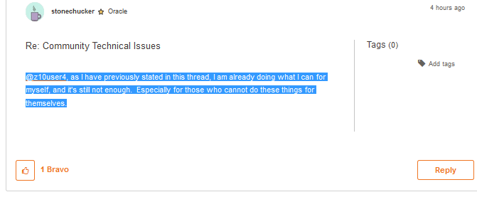
@Anonymous, as I have previously stated in this thread, I am already doing what I can for myself, and it's still not enough. Especially for those who cannot do these things for themselves.
- Mark as New
- Subscribe
- Mute
- Subscribe to RSS Feed
- Permalink
- Report Inappropriate Content
01-22-2019 12:52 PM
@srlawren Well done. Without knowing how Lithium platform is handled for formatting, i can't say it is possible. @David_J can play around with it and make it happen if possible.
______________________________________________________________________
I am not a mod. Do not send me private message with your personal info.
If you need to contact PM Customer Support Agent, send a Private Message.
- Mark as New
- Subscribe
- Mute
- Subscribe to RSS Feed
- Permalink
- Report Inappropriate Content
01-22-2019 12:50 PM - edited 01-22-2019 12:56 PM
You can CAPS and assert your rights all you want (and you're entitled to them) but we all know the speed at which things get done around here.
Are there not add-ons in whatever browser to change contrast or enlarge text or whatever you need to be able to read this site?
Edit: are there not contrast settings on the screen itself? Or reversing the white to black?
- Mark as New
- Subscribe
- Mute
- Subscribe to RSS Feed
- Permalink
- Report Inappropriate Content
01-22-2019 12:46 PM
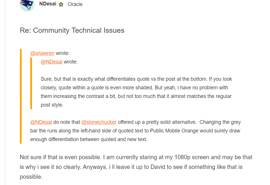
@NDesai wrote:Not sure if that is even possible. I am currently staring at my 1080p screen and may be that is why i see it so clearly. Anyways, i ll leave it up to David to see if something like that is possible.
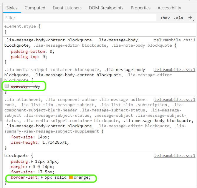
@NDesai actually, it's entirely possible and requires two very simple changes to the blockquote style in the telusmobile.css file:
1) remove the opacity: 0.8
2) change the color on the border-left to "orange" (or some custom hex value of PM's proprietary orange--though the stock "orange" seems to match pretty closely).
I've mocked it up here:
and shown the very simple CSS changes here:
>>> ALERT: I am not a moderator. For account or activation assistance, please click here.
- Mark as New
- Subscribe
- Mute
- Subscribe to RSS Feed
- Permalink
- Report Inappropriate Content
01-22-2019 12:46 PM
@NDesai, I am currently looking at a 26" LCD panel with a huge resolution, using zooming software that gets the print larger, however, the CONTRAST is not drastic enough for me to see it. It is like it is invisible text. I struggle every day I look at this website when I'm trying to assist others.
The eye strain I go through to do this is insane, and I'm choosing to help others.
It is obvious that software is made by folks who have 20/20, non-impair or correct to 20/20 vision, without the thought of others who cannot use the service as 'a regular person'.
I'm tired of having to explain to people that I can not easily read something, even with corrective glasses, magnifying lenses, and other such visual aids. I'm already doing what I can to help myself - sometimes I need the help of others, to assist a larger community.
- Mark as New
- Subscribe
- Mute
- Subscribe to RSS Feed
- Permalink
- Report Inappropriate Content
01-22-2019 12:39 PM
@srlawren @stonechucker I have reviewed some posts on HP and PayPal communities which are also based on Lithium platform. They also have the exact same set up for quotes.
______________________________________________________________________
I am not a mod. Do not send me private message with your personal info.
If you need to contact PM Customer Support Agent, send a Private Message.
- Mark as New
- Subscribe
- Mute
- Subscribe to RSS Feed
- Permalink
- Report Inappropriate Content
01-22-2019 12:37 PM
@NDesai, @David_J, as a person with a visual impairment, that I am not hiding from anyone, I have the right to access printed or type material in a form that I can read. The shading is EXTREMELY difficult for me to read DUE TO MY VISION IMPAIRMENT.
It is discrimination based on human rights to not attempt to provide such information in a more accessible format when requested. I have made similar requests in the past, and yet still no progress on this type of request.
I could complain about lack of contrast in the choice of thin font text used as 'Cancel' hyperlinks without boxes around them, the almost invisible 'Delete' button to remove PM inbox and sent box messages, and various other lack of contrast items, but I'm sure the quoted text is a simpler fix for the short term, and the others can be focused on later.
Perhaps I can use my status as a NEW ORACLE to influence accessibility concerns further in the Public Mobile Community.
- Mark as New
- Subscribe
- Mute
- Subscribe to RSS Feed
- Permalink
- Report Inappropriate Content
01-22-2019 12:34 PM
@Luddite wrote:@Anonymous FYI: as far as I can tell quebec12345's posts have all been non-sequitars in French on the English forum suggesting folks leave PM.
I know. I ran it through Google Translate and then replied starting with "one year?!" then asking him what he has tried to do about it and what the problem is. Then I directed him to the French side. But srlawren did that much better than I did.
I know you're active on the French side so thanks.


