cancel
Showing results for 
Search instead for 
Did you mean: 
David
Model Citizen / Citoyen Modèle

I have one, easy-to-implement, suggestion to make!


Some people (including myself) don't want/like to calculate.  Right now, in Self-Serve, we have absolute plan due date.  I'd like to see relative date as well in "days remaining".


Like this:
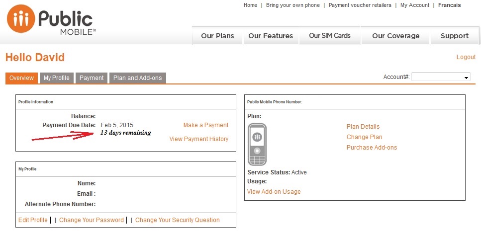
DaysRemainingIdea.jpg


Does anyone else agree?  It allows customers to take a quick glance at how long they have until renewal comes 🙂

13 Comments
makkahn28
Mayor / Maire

Smiley LOLYes, Absolutely. But, I also Wish PM had Anniversary Dates too, Like how VM and other similar Carriers have

Krystal_D
Great Citizen / Super Citoyen

I agree as well. it would make budgeting easier for some customers if they know at a quick glance how may days are left until payment is due

Graeme
Good Citizen / Bon Citoyen

In the interests of clarity and good accounting practices, it would be a welcome addition. You could go even further than that, by displaying:


"You have used up 25 days of your current plan. You have 5 days use remaining.


Remember to renew before midnight on the day prior to due date."


The last sentence is for voucher users. For people who have registered a credit card they wouldn't have to worry about that.

makkahn28
Mayor / Maire

That's an excellent point

Val_T
Retraité / Retired
Retraité / Retired

It looks like this idea has been getting some love. So we would like to expand on this specific topic and ask for more feedback.


Overall, do you think it’ll be easier for you to manage your account in Self Serve if you could view the most important details about your account on one page? If so, would you want to see the following account details on your home page?


  • The amount of data remaining in your current rate plan
  • Purchased add-ons and their usage
  • If service is suspended, display how many days are remaining until your account is cancelled
  • Relevant promotions and important messages from Public Mobile
  • Any other suggestions

Let us know what you think in the comment section down below.

makkahn28
Mayor / Maire

Hi. Yes, that's perfect

David
Model Citizen / Citoyen Modèle

@Val_T


Well, at first I only wanted a days left counter, but since you're asking... hehehe


First page should be an "at a glance" everything, but no fine details.


Something like (for an active account):

Your plan renews on: March 7th (26 days left)

Your plan has

Voice minutes: Canada-wide unlimited (unlimited left)

SMS/MMS: International unlimited (unlimited left)

Included data allowance: 1GB (231MB used, 793MB left)

Data addons: 1.5GB (0MB used, 1536MB left)


Now for an expired account:

Your plan renews on: Expired (81 days until cancellation)

Your plan has

Voice minutes: Canada-wide unlimited (expired)

SMS/MMS: International unlimited (expired)

Included data allowance: 1GB (231MB used, 793MB left, expired)

Data addons: 1.5GB (0MB used, 1536MB left, expired)


Each line would be a clickable hyperlink taking the user to the detailed view/usage (instead of the tabs used now). As said, simple at-a-glance quick look at everything on the main page, with clickable links for detailed view. The payment and account management parts can stay as they are (for now).


My very humble opinion 🙂

makkahn28
Mayor / Maire

That's an Excellent Tool

waynebrett2000
Good Citizen / Bon Citoyen

I think it's a great idea to put all of these suggestions on the first page of our accounts.

makkahn28
Mayor / Maire

That's Smart

Need Help? Let's chat.