- Community Home
- Announcements
- Re: Welcome to our New Community!
- Subscribe to RSS Feed
- Mark Topic as New
- Mark Topic as Read
- Float this Topic for Current User
- Subscribe
- Mute
- Printer Friendly Page
Welcome to our Community!
- Mark as New
- Subscribe
- Mute
- Subscribe to RSS Feed
- Permalink
- Report Inappropriate Content
01-04-2022 11:26 AM - edited 03-02-2023 08:39 AM
Hey Community,
We are delighted to launch our newly redesigned Community.
We hope you like the fresh new look, and that the new design will allow you to find information you need quickly and easily. Curious about our new upgrades? We’ve highlighted a few of our favourites:
New Layout:
- The modern interface makes it easy to ask a question to our Community and receive quick responses from a Community expert
- No desktop? No problem. We made this platform mobile friendly! Making it easy to search or post a question while your on the go.
Boards & Forums
Announcements:
The Public Mobile team uses this board to feature new business updates and to keep our customers informed about new promotions and programs.
Get Support:
Looking for help with your Public Mobile service? This is the place to post all support questions. Our Oracles and support members answer topics posted under this board.
The Lounge:
Just for fun. Want to share your interests, hobbies and anything that’s not related to phone-stuff? The Lounge is the place to be.
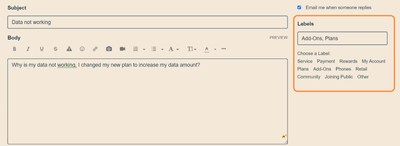
Label your questions:
- Each question posted on the “Get Support” board will require a minimum of 1 label attached. Try to attach the label that fits best with your question.
Example: Why is my data not working, I changed my new plan to increase my data amount? Best label to attach: [Plans].
This will help keep all those great questions organized in our Community.
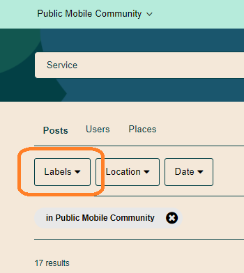
If you’re searching for a specific topic, try clicking our labels filter to find exactly what you’re looking for.
Private Messaging
- We’ve also refreshed the look and layout of the private messaging inbox. We’ve made it easy to find your threads and communicate with agents or staff.
- To access your private messaging inbox, click the envelope icon in the top right corner.
- Conversations are now threaded! If you need to leave and return to a message at a later time, your thread will save exactly where you left off.
For more information on Community visit these Help Article links:
Like most new things, it will take some getting used to. Remember we have our Oracle and Public Mobile teams to assist with any questions you have. Let us know your thoughts & happy asking & supporting!
- Public Mobile Team
- Mark as New
- Subscribe
- Mute
- Subscribe to RSS Feed
- Permalink
- Report Inappropriate Content
01-20-2022 04:41 PM
Or in other words you are missing everything!
- Mark as New
- Subscribe
- Mute
- Subscribe to RSS Feed
- Permalink
- Report Inappropriate Content
01-20-2022 04:23 PM
@pm-smayer97 No you're not missing anything...just an awful mess IMO!
- Mark as New
- Subscribe
- Mute
- Subscribe to RSS Feed
- Permalink
- Report Inappropriate Content
01-20-2022 04:22 PM
For instance, clicking on the label "Community" in your post above takes me to see all other threads tagged with that label.
- Mark as New
- Subscribe
- Mute
- Subscribe to RSS Feed
- Permalink
- Report Inappropriate Content
01-20-2022 04:22 PM
There is a pull down menu for Recent topics/Recent replies/Most Viewed/Most commented.. but not very useful
I just talking about I cannot even find a new Announcement posted 20 mins ago
- Mark as New
- Subscribe
- Mute
- Subscribe to RSS Feed
- Permalink
- Report Inappropriate Content
01-20-2022 04:21 PM
Labels or "tags" are still present, as are the three forums: Get Support, Lounge, and Announcements.
- Mark as New
- Subscribe
- Mute
- Subscribe to RSS Feed
- Permalink
- Report Inappropriate Content
01-20-2022 04:20 PM
So there are no more groupings of posts? The only way to find anything is to search? No more browsing categories of posts? No more identifying categories with new posts? Is everything essentially lumped together, save for the 3 or so "categories", Announcements, Support, Lounge?
What am I missing?
- Mark as New
- Subscribe
- Mute
- Subscribe to RSS Feed
- Permalink
- Report Inappropriate Content
01-20-2022 01:27 PM
@Zyl wrote:@darlicious @hTideGnow And there should be one more tool besides quote added into the toolbar, the strikethrough tool if they don't want to give us the ability to delete our post. Now for anyone who wants to strike out their texts, they can't fix it in their cell and have to wait to get to a desktop to do it. 🙂
Oh, you are saying mobile site version does not have strikeout???
That inconsistency is really troublesome; two teams - desktop and mobile are not talking to each other.
- Mark as New
- Subscribe
- Mute
- Subscribe to RSS Feed
- Permalink
- Report Inappropriate Content
01-20-2022 01:14 PM
@darlicious @hTideGnow And there should be one more tool besides quote added into the toolbar, the strikethrough tool if they don't want to give us the ability to delete our post. Now for anyone who wants to strike out their texts, they can't fix it in their cell and have to wait to get to a desktop to do it. 🙂
- Mark as New
- Subscribe
- Mute
- Subscribe to RSS Feed
- Permalink
- Report Inappropriate Content
01-20-2022 01:06 PM
@Yummy I find participating on the forum over the phone to be quite convenient especially when you just want to do something to kill time but you are not at your desk. When you have xl cellphone screen, it's not too bad. But the edit reply box size is just too small even for desktops.
- Mark as New
- Subscribe
- Mute
- Subscribe to RSS Feed
- Permalink
- Report Inappropriate Content
01-20-2022 12:20 PM
@hTideGnow wrote:HI @Zyi
Totally agree the edit reply box is too small. We can at least enlarge it on Desktop browser, but no such option when using it on the phone
Frankly speaking, I cannot imagine somebody to get involved in Community through mobile phone. For me, screen is way to small, software keyboard not that accurate, etc.
Maybe younger generation born with cell phone as additional body part can handle it but I still prefer real keyboard, big(er) screen and mouse.
- Mark as New
- Subscribe
- Mute
- Subscribe to RSS Feed
- Permalink
- Report Inappropriate Content
01-20-2022 12:16 PM
HI @darlicious
Really? Why they remove it? Everyone was asking for it
I thought it was limitation because I was thinking of the quote " button with the other button on the toolbar, the toolbar space is smaller and hence I thought that way. Never aware they can have an actual Quote Button there.
Bring it back!!!
thanks @darlicious
- Mark as New
- Subscribe
- Mute
- Subscribe to RSS Feed
- Permalink
- Report Inappropriate Content
01-20-2022 12:14 PM
There used to be a big ol quote button for everyone. They got rid got rid of it in March or April of 2020.
To contact customer support click below:
https://productioncommunity.publicmobile.ca/t5/notes/composepage/note-to-user-id/22437
To pre-verify your account include your full name, address, email, phone # and 4 digit acct pin #.
- Mark as New
- Subscribe
- Mute
- Subscribe to RSS Feed
- Permalink
- Report Inappropriate Content
01-20-2022 12:09 PM
HI @Zyi
Totally agree the edit reply box is too small. We can at least enlarge it on Desktop browser, but no such option when using it on the phone
The quote tool on the cellphone is one of the most asked feature. It was a problem from the old one. But I think it likely a limitation with the software they use.
- Mark as New
- Subscribe
- Mute
- Subscribe to RSS Feed
- Permalink
- Report Inappropriate Content
01-20-2022 11:54 AM
Yes I am not too happy with my hybrid leaning more towards the inabilities given to mobile users.
To contact customer support click below:
https://productioncommunity.publicmobile.ca/t5/notes/composepage/note-to-user-id/22437
To pre-verify your account include your full name, address, email, phone # and 4 digit acct pin #.
- Mark as New
- Subscribe
- Mute
- Subscribe to RSS Feed
- Permalink
- Report Inappropriate Content
01-20-2022 11:39 AM
@Yummy I will try to see if I can make the edit reply box bigger for at least desktop. But I still like how it was before that it was the same size as the original text box and not smaller just because you are editing the reply
- Mark as New
- Subscribe
- Mute
- Subscribe to RSS Feed
- Permalink
- Report Inappropriate Content
01-20-2022 11:34 AM
@darlicious yup it's best to use desktop to post on here and even with that, the small edit reply box is challenging at times.
- Mark as New
- Subscribe
- Mute
- Subscribe to RSS Feed
- Permalink
- Report Inappropriate Content
01-20-2022 10:52 AM - edited 01-20-2022 10:52 AM
Great suggestions! We had great hope the quote button would return with the community make over but alas pm has made the forum more difficult to use rather than easier. I can't imagine having to use it on my phone for any length of time. The tablet is troublesome enough.
To contact customer support click below:
https://productioncommunity.publicmobile.ca/t5/notes/composepage/note-to-user-id/22437
To pre-verify your account include your full name, address, email, phone # and 4 digit acct pin #.
- Mark as New
- Subscribe
- Mute
- Subscribe to RSS Feed
- Permalink
- Report Inappropriate Content
01-20-2022 10:32 AM
1. >>> - Make the edit reply box bigger
You can do that your yourself grabbing bottom right corner and dragging it down. It can go indefinitely as you scroll main screen.

2, >>> -Include a function to delete a reply
Idea is good but that will lead to 'abuse' by some members. They will post reply, few people will correct or negatively comment it and OP will delete it and conversation track will be lost. You would see few 'funny' replies not knowing what they reply to.
Decent solution is just to admit your mistake, cross the wording and either correct your reply or leave as is. (crossed).
- Mark as New
- Subscribe
- Mute
- Subscribe to RSS Feed
- Permalink
- Report Inappropriate Content
01-20-2022 10:21 AM - edited 01-20-2022 11:41 AM
So far the new community forum is working out well but I was wondering if I can make the following suggestions, would be great if they can be adopted. These suggestions pertain more to using the forum with a cellphone. Since public mobile is making the forum to be more cellphone-friendly, I thought I chime in with my 2 cents. Thanks in advance.
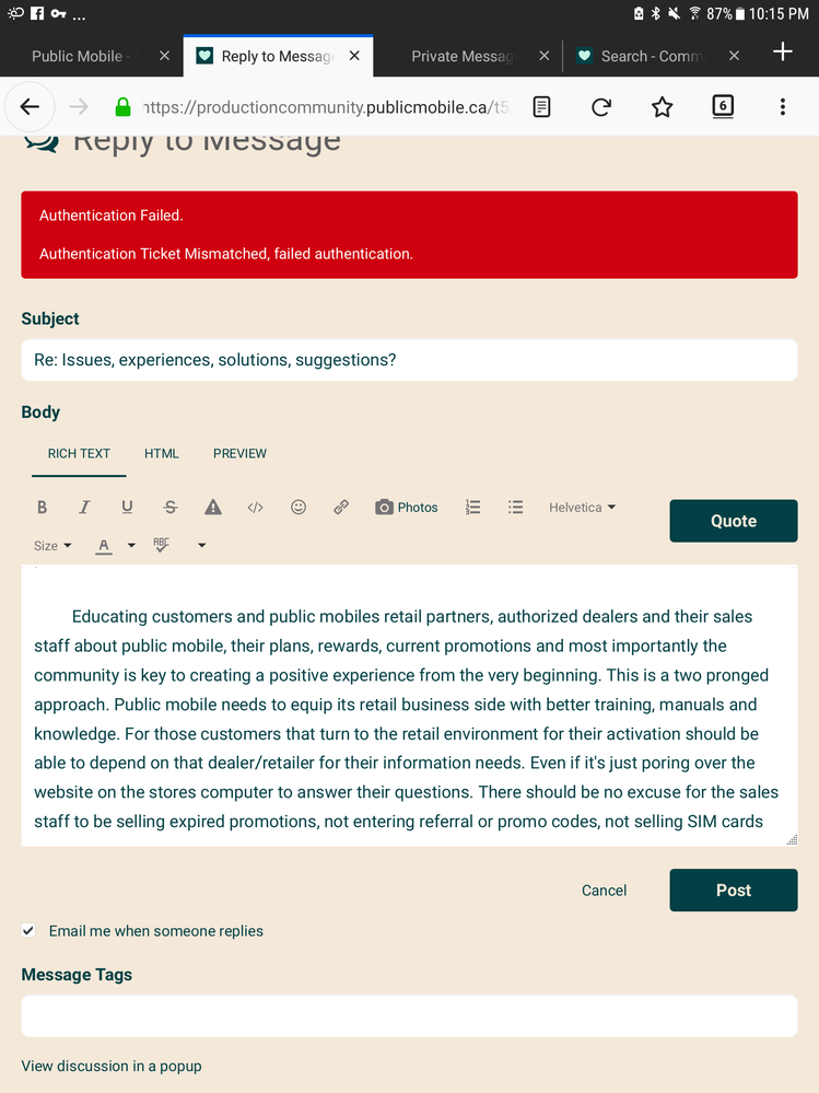
- Make the edit reply box bigger. We used to have the full text box displaying the full texts for us to edit, now we only get a tiny text box that just displays a few lines for us to work with. It's especially hard to work with when you are using cellphones. I mean if we are already submitting replies to help others so they won't bother CS_Agent, we might as well get the original text box for us to edit the reply to make them better.
-Include a function to delete a reply in case when you realize you've given a wrong answer or to the wrong question. Would make the thread neater and less confusing for all.
-Include the quote tool on the toolbar when posting replies using a cellphone. When using the cellphone to post replies, you don't get the full toolbar, that's understandable but the quote tool should be on the toolbar imo.
-Remove the chat icon when posting to the forum. The text box for writing/editing the reply/question is small as it is. With the chat icon there obscuring everything, it's a bit hard to see what you type when you're using a cellphone. When using a desktop, you don't see the chat icon at all when posting, if it could be made the same for cellphone, that would be great.
Thanks
- Mark as New
- Subscribe
- Mute
- Subscribe to RSS Feed
- Permalink
- Report Inappropriate Content
01-19-2022 11:54 PM
As much as we scream, I have been asking: Is PM still going to tweak it based on our feedback? Or too late, they sent the developers home already? Of course, I would like to see tweaks, but if they are not going to , then we can save our comment for the next major update (3 years later????)
- Mark as New
- Subscribe
- Mute
- Subscribe to RSS Feed
- Permalink
- Report Inappropriate Content
01-19-2022 11:50 PM
@sunflowershine wrote:The new platform is not that user friendly.
That's an understatement. Yes, there are good aspects, but I feel that these changes had the exact opposite of the desired effects.
- Mark as New
- Subscribe
- Mute
- Subscribe to RSS Feed
- Permalink
- Report Inappropriate Content
01-19-2022 09:39 PM
The new platform is not that user friendly.
- Mark as New
- Subscribe
- Mute
- Subscribe to RSS Feed
- Permalink
- Report Inappropriate Content
01-18-2022 02:29 AM
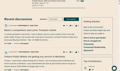
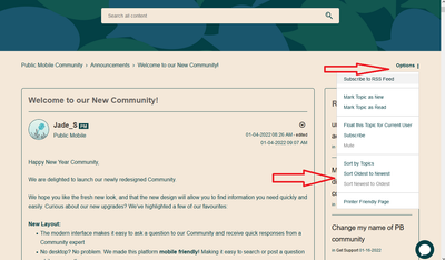
There's this display option at the top of the new list and the new lounge:
Sorted by will sort by the topic most recently made or the topic with the most recent reply in it.
Or there's this in a thread to sort the list from oldest to newest or newest to oldest.
- Mark as New
- Subscribe
- Mute
- Subscribe to RSS Feed
- Permalink
- Report Inappropriate Content
01-18-2022 02:13 AM
In your profile>>my settings>>my preferences>>I believe it's linear layout if I remember correctly.
To contact customer support click below:
https://productioncommunity.publicmobile.ca/t5/notes/composepage/note-to-user-id/22437
To pre-verify your account include your full name, address, email, phone # and 4 digit acct pin #.
- Mark as New
- Subscribe
- Mute
- Subscribe to RSS Feed
- Permalink
- Report Inappropriate Content
01-18-2022 02:02 AM
@cellphoneuser1 wrote:
@Zyl wrote:
@softech wrote:Thanks @J_PM ..still testing it out.. the way it shows replies now is confusing.
used to be the last replies always last.. now.. if there are 5 replies.. and if I replies on the 2nd reply (I am the 6th reply), it will jammed after the 2nd reply.. so the order is 1 , 2 , 6 , 3, 4, 5.. not sure if it is good
update.. ok.. maybe not..look good now.. maybe just a hiccup or a refresh is needed..thanks
Oh no, the Community forum threads are now grouped by conversation!! I absolutely detest conversation views!! I turn it off in both my gmail and Yahoo! mail and I absolutely hated it in Facebook Groups. Can't believe I am still stuck on it on a forum. 😞 The concept sounds great on paper in that it sounds more organized and it makes more sense intuitively but it's extremely impractical in real life. First, this is going to be so inefficient in finding replies. Honestly it would've been so much more straightforward to just have all the replies shown chronologically. Who cares which replies are pertaining to which previous replies? We are not filing replies here. We just want to see what's the most recent updates on a thread. Now we would have to go through every single original reply and expand it to see all of the new replies.
Second, you lose the flow of the conversation. When you are checking the new replies, you won't know which ones came first because you won't be able to keep track of them after checking them in every single originating reply and replies are going to be lost as people won't see them and you won't get Bravo's or Solutioned if Bravo'es you receive is actually counted in the calculation of Community Reward.
There are settings to change that. Replies can be be changed to show chronoligically. For the reply showing after the replied message, refresh the page and it goes back to normal.
Can you show me where I can change that setting please to return the replies view to chronological instead of this conversation view?
Thank you
- Mark as New
- Subscribe
- Mute
- Subscribe to RSS Feed
- Permalink
- Report Inappropriate Content
01-17-2022 03:45 PM
@cellphoneuser1 Yes, but it always defaults back to Recent Topics after reading any thread (at least for me). It's not practical for customers asking questions or users trying to offer suggestions.
I hope PM is considering some tweaks/changes to make it more user friendly soon!
- Mark as New
- Subscribe
- Mute
- Subscribe to RSS Feed
- Permalink
- Report Inappropriate Content
01-17-2022 08:27 AM
yup.. I found out after that. Just a refresh and things go back the correct order again
- Mark as New
- Subscribe
- Mute
- Subscribe to RSS Feed
- Permalink
- Report Inappropriate Content
01-17-2022 05:43 AM - edited 01-17-2022 05:45 AM
@Zyl wrote:
@softech wrote:Thanks @J_PM ..still testing it out.. the way it shows replies now is confusing.
used to be the last replies always last.. now.. if there are 5 replies.. and if I replies on the 2nd reply (I am the 6th reply), it will jammed after the 2nd reply.. so the order is 1 , 2 , 6 , 3, 4, 5.. not sure if it is good
update.. ok.. maybe not..look good now.. maybe just a hiccup or a refresh is needed..thanks
Oh no, the Community forum threads are now grouped by conversation!! I absolutely detest conversation views!! I turn it off in both my gmail and Yahoo! mail and I absolutely hated it in Facebook Groups. Can't believe I am still stuck on it on a forum. 😞 The concept sounds great on paper in that it sounds more organized and it makes more sense intuitively but it's extremely impractical in real life. First, this is going to be so inefficient in finding replies. Honestly it would've been so much more straightforward to just have all the replies shown chronologically. Who cares which replies are pertaining to which previous replies? We are not filing replies here. We just want to see what's the most recent updates on a thread. Now we would have to go through every single original reply and expand it to see all of the new replies.
Second, you lose the flow of the conversation. When you are checking the new replies, you won't know which ones came first because you won't be able to keep track of them after checking them in every single originating reply and replies are going to be lost as people won't see them and you won't get Bravo's or Solutioned if Bravo'es you receive is actually counted in the calculation of Community Reward.
There are settings to change that. Replies can be be changed to show chronoligically. For the reply showing after the replied message, refresh the page and it goes back to normal.
- Mark as New
- Subscribe
- Mute
- Subscribe to RSS Feed
- Permalink
- Report Inappropriate Content
01-17-2022 05:13 AM - edited 01-17-2022 05:14 AM
@softech wrote:Thanks @J_PM ..still testing it out.. the way it shows replies now is confusing.
used to be the last replies always last.. now.. if there are 5 replies.. and if I replies on the 2nd reply (I am the 6th reply), it will jammed after the 2nd reply.. so the order is 1 , 2 , 6 , 3, 4, 5.. not sure if it is good
update.. ok.. maybe not..look good now.. maybe just a hiccup or a refresh is needed..thanks
Oh no, the Community forum threads are now grouped by conversation!! I absolutely detest conversation views!! I turn it off in both my gmail and Yahoo! mail and I absolutely hated it in Facebook Groups. Can't believe I am still stuck on it on a forum. 😞 The concept sounds great on paper in that it sounds more organized and it makes more sense intuitively but it's extremely impractical in real life. First, this is going to be so inefficient in finding replies. Honestly it would've been so much more straightforward to just have all the replies shown chronologically. Who cares which replies are pertaining to which previous replies? We are not filing replies here. We just want to see what's the most recent updates on a thread. Now we would have to go through every single original reply and expand it to see all of the new replies.
Second, you lose the flow of the conversation. When you are checking the new replies, you won't know which ones came first because you won't be able to keep track of them after checking them in every single originating reply and replies are going to be lost as people won't see them and you won't get Bravo's or Solutioned if Bravo'es you receive is actually counted in the calculation of Community Reward.
- Mark as New
- Subscribe
- Mute
- Subscribe to RSS Feed
- Permalink
- Report Inappropriate Content
01-12-2022 07:00 PM
yeah it's pretty awesome that option pops up.
